Pio Tosini Parma Ham
Logos, Legends, Quotes, and Carefully Cured Ham Legs
If you like cured ham, if you’re partial to Prosciutto di Parma, if you like love stories, or are intrigues by great design, this essay is for you!
Last fall I had a chance to visit with Pio Tosini, our long time supplier of Parma ham, in their hometown of Langhirano. My appreciation for the product remains as high as ever. But I came away with a whole new perspective on the product. I fell in love with a logo. And I flew home wondering to myself: Maybe our historical frame on Prosciutto di Parma, while not wrong, might be limiting how we appreciate it. What if we viewed Prosciutto di Parma more as a modern revelation than an ancient rite? And what if there’s more to a logo than meets the casual eye? The answers to these and other odd questions follows. One of the best cured hams you’ve ever eaten awaits. Stop by the Deli any time and ask for a taste!
I headed to Emilia-Romagna in Italy, in part to visit our longstanding producer of Prosciutto di Parma. I’ve been to the region many times before so, while I always embark with the intent of learning new things, I didn’t expect to come away with a whole new perspective on this special product. My appreciation for the product itself remains as high as ever. But my sense of its history has taken an unexpected, artfully interesting, turn. I think for the better.
The story of Prosciutto di Parma is pretty well known around the food world—it nearly always starts a couple thousand of years ago in the time of the Caesars. Here’s what the Consorzio (the organization, founded in 1963, that represents the 156 producers and works to make sure that agreed-upon production procedures are maintained) has to say: “Since Roman times, the unique conditions of the Parma region have made it possible to produce the highest quality hams that have been appreciated by gourmets for centuries. ‘Prosciutto’ is from the Latin ‘perexsuctum’ meaning ‘dried’ – an indication of the purity of Parma Ham production and its ancient roots. It was in 100 BC that Cato the ‘Censor’ first mentioned the extraordinary flavour of the air cured ham made around the town of Parma in Italy; the legs were left to dry, greased with a little oil and could age without spoiling. A tasty meat was obtained which could be eaten over a period of time while maintaining its pleasant flavour. Even earlier, in 5 BC, in the Etruscan Po river valley, salted preserved pork legs were traded with the rest of Italy and with Greece.”
I’ve heard the tale many times. It’s how I’ve always thought of Prosciutto di Parma too, and I’d guess how most other modern day food folks still think of it now. Yes, for sure, the story can start two thousand years ago. But in a sense, prosciutto as we know it—made in factories—some very small and some super large—to be sold to people like you and I, to be served in specialty shops, restaurants, bars and what Italians might call alimentari, is really relatively new. It’s not of the era of ancient Rome, but more of Theodore Roosevelt or the Russian Revolution.
This new sense of the story starts in the modern era, maybe a century or so ago. Because really, up until the late 19th and really the early 20th century, prosciutto (like cheese) was mostly something made at home, to be eaten by the family. On occasion, a few hams might have been sold to neighbors or in the local market. But with this new time frame in mind, my mental picture of the product started to shift. It’s only in the late 19th and early 20th centuries that it started to shift from being a well known regional specialty to international stardom that it currently enjoys.
Don’t worry, the elegant, rosy color and lovely light brown skin on the outside of the ham remains the same as they always have. Prosciutto di Parma is equally deliciously and lovely no matter where the story starts. To prove the point, there’s a photo that my girlfriend Tammie took of me, my back to the camera, walking through the aging rooms on our visit last fall that sums it up.
Row after row of sturdy wooden racks, golden brown hams hanging from ropes, probably twenty rows high. I look tiny walking between two rows, hams extending from the just above the floor up to probably fifty feet high. That’s the classic image I’ve long held. It’s a hard one to forget. What I wrote fifteen years ago after an earlier visit to Langhirano remains just as true today. “The most striking part of this scene to me is always the aging rooms. Even though I’ve walked through quite a few, the experience always sets my mind reeling. I feel like I’m in one of those movies where the hero finally finds the secret treasure cave, and stands stunned, speechless, staring at it all glistening in the light. “The whole room takes on the color of the hams,” one of my companions comments. No lie—there really is a golden glow. The light in the aging rooms is… heavenly. It’s eerily awesome, glamorously golden, the sort of thing ancient Catholic painters put behind saints. In fact, I wonder why no great painter has tackled the task of reproducing this special color on canvas.
But while all that has remained as remarkable as ever, my sense of the product is different. My point is that the excellent Prosciutto di Parma, the ham that Pio Tosini cures, the stuff we love to eat thin slices of, the ham that’s famous world wide, is really a product not of ancient Rome, but rather, for the purposes of this piece at least, of the 20th century. And that the work of Pio Tosini—which began formally in 1905 – is the very place to mark the beginning of the production of this special cured ham. Now that I think about it, actually a very modern image. Because up until fifty or so years ago, one would almost never have seen that many hams all in single spot. Prosciutto curing in this quantity—even for an artisan house like Pio Tosini—is strictly a modern phenomenon.
Love and Logos
It’s in this sense that I started to think differently, too, about a piece of the Pio Tosini picture that I’d barely attended to before this visit. Their logo. That’s right—the small bit of visual iconography that appears, very elegantly, on the label that goes onto every piece of their ham. The logo, simple though it is, I realize now, doesn’t just look good. It’s an image that draws me in, one that ignites my imagination, one that makes me think more about quotes and stories and thin delicate slices of pale pink in color, sweetly delicate in flavor, Parma ham. When I stopped to really take in its beauty, I realized that the Pio Tosini logo also speaks very eloquently. It tells a tale of art, and artisans, of a couple who cared deeply for each other, of a family who care deeply about their craft, and, I now realize, it speaks very eloquently of the dawning of the new, modern era of Prosciutto di Parma.
To be clear, this is not the first time I’ve looked closely at a logo. I like design. I like great food. Odd as it may sound to some, I really love great logos. And I totally, totally love it when the quality of a logo on a page is congruent with the quality of the product we put in our mouths. The two—great products and great logos—don’t come together as often as you might think. There are certainly a whole bunch of fantastically full flavored artisan foods on our shelves and in our refrigerated cases. And it’s not all that hard to find really wonderfully design out in the world. But coming up with examples where the two appear in tandem is a rather uncommon occurrence. When the look is as lovely and clear and compelling as the flavor of the food it represents, that’s a special moment. Art historian Rudolf Arnheim wrote that, “In a work of art, a figure comes to acquire presence by the function it fills.” His description says it well. The Pio Tosini logo is truly exceptional. It fits, perfectly it turns out, with the idea of prosciutto as a manifestation of modern culinary magic. Pio Tosini is a terrific marriage of the two. The design is as good as the prosciutto is delicious.
The modern word logo is an abbreviation of “logotype” which comes from the Greek, logos meaning “word” and “typos” meaning “type.” In 1890, the US had 700 lithographic printing firms employing more than 8,000 people. Back in those days a “logotype” was made when all the letters (or letters and artwork) we’re fused into one metal type piece. The modern logo is likely descended from the ancient Middle Eastern cylinder seals, or in more recent times, medieval coats of arms. The latter has gotten me thinking that logos in modern day marketing then are essentially the equivalent of coats of arms for our companies. We “ride into battle” every day carrying them on products, t-shirts, banners, and websites. I think a great logo is like a great product. Which I guess is sort of the point, right? I mean, I guess the best logo is the most aligned with its own product. So, in that sense the power of the Pio Tosini logo isn’t just that it looks good. It’s that the ham itself is every bit as elegant, striking, special and memorable as the mark.
Of course, it’s not like the trip to Italy this past fall was the first time I’ve seen the Pio Tosini logo. To the contrary, we’ve been selling their cured ham—happily—for years, over the course of which I’ve probably seen it hundreds of times. And yet, apparently, I’d never really seen it. Something, this time, standing in the late November, early morning fog, caught my attention, and then shifted my mind, in a new direction.
It always catches me off guard when things show up like that, things that I should, in hindsight, have seen all along. But then I suppose if a foreign film or a good book can take two or three or six passes before you take in all the detail, then it would make perfect sense that life—or a good logo—could take even longer. We often pass right by powerful and creative things without noticing them for years. Or decades. Or ever. We all, by dint of being human, miss more than we make note of. It’s good here to remind myself of author of Rebecca Solnit’s insightful statements: “Some ideas,” she says, “are new, but most are only recognition of what has been there all along, the mystery in the middle of the room, the secret in the mirror.” The logo has been there, on every leg of ham we’ve gotten from them, all along, I just never paid it proper attention. This time, walking up towards the small but proud Pio Tosini plant, seeing it painted big and bold, in forest green paint on a cream colored background, emblazoned onto the front of the building in which their prosciutto is so carefully cured, caught my attention anew. Now that I’ve seen it this way, I’ve taken it in and internalized it, and I can’t stop thinking about it.
Although I’m a little embarrassed that it took me this long, I’m glad it finally happened. I’ve long loved the ham itself. I have great respect for Giovanni Bianchi—the fourth generation of the family to run the business—as both an artisan, and as the creative and caring human being he is. But the logo has taken my passion for his prosciutto to a new level. Now that it’s lodged itself in my brain, honestly, I’d probably buy the ham for the first time just because of the way the logo looks. Seriously. It’s that good. And thankfully, so is the ham!
Check it out:
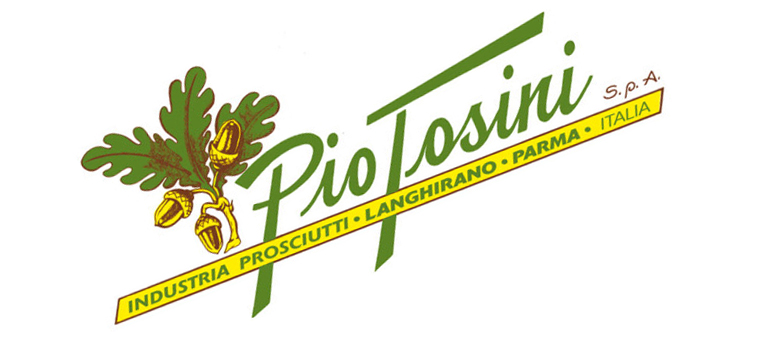
To the left, three green oak leaves. Still attached to the branch, pointing out from there, a bit like the palm of a hand. Each is slightly serrated, sort of softly curving, one to the left, the other two to the right. They’re framed by a thin brown circle, made more effective from a design standpoint by having the leaves cross over the border. Three pale yellow and brown acorns, the distinctive round caps, and smooth-inch shells, hanging from the same stem, two pointing down, one growing “up.” The acorns and oak set the background. They sit, quietly but supportively to the left of the company name—Pio Tosini. Pio was Giovanni’s grandfather. But in the moment I’m focused here more on the graphics, the name of the company.
I don’t think I can type these words onto the page to convey the grace, the vibrancy, the quietly smiling, calm, considered, not-at-all-cocky but definitely confident look of the script. The P and the T are particularly big, and bold. Longer by a lot than the rest of the letters. Graceful, yet modern. Bold, but still beautiful. Striking, yet subtle. Like the words that follow from them—Pio Tosini—they’re leaning gently forward. Looking ahead. Lovely. Lovingly. Firm. Focused. Fine, as in quality. The top of the T in particular gets wider as it moves to the right, a jumping off point. It was, I imagine, in the moment of its creation, a bold statement about strength and vitality of the product it represents. It makes me think, now, not of Roman legions, but of early automobiles, the introduction of electricity, and a positive pa th into to the future of Prosciutto di Parma.
Giovanni’s grandmother, Maria Scotti, did the logo work in the late 1930s. “She came from a well-educated, upper class family from Parma [about 20 miles to the north—remember, that was a long way in those days]. My grandpa Pio was born and raised in Langhirano. His family was originally from a small village in the Appennino mountains,” Giovanni told me. I can only imagine that their families would have had some doubts. A young man of middle class means from a rather remote mountain village and a well-to-do, highly cultured city girl? Not a common connection in those days (or maybe even now). But as many of us have in our own lives, they left behind some of their past to create their own reality. “Both of my grandparents lost their fathers quite young (my grandma lost hers in the WWI) so they didn’t have much family ties,” Giovanni shared. “They kind of started a new family themselves.” It is, I realize, essentially what I’m suggesting about this shift in the historical context of Prosciutto di Parma—not to erase the past, but rather to re-prioritize and reposition it so that the present and the future, not ancient history, get the higher priority.
In nature, diversity often creates health and creativity. In this case, the difference in their backgrounds—brought together by shared values, a great sense of style and, of course, strong mutual attraction—turned into something special. Maria, her grandson told me, was not unfamiliar with the basic principles of good design. “My grandma, she graduated at the Parma School of Arts,” Giovanni said. “They both had great taste and style.” That shared sensibility played out beautifully, both in the graphics and the goodness of the ham. It makes sense. As anarchist playwright, poet and professor Paul Goodman wrote, “Those who draw on natural powers find it easy to be inventive.” I’m going to say then, in my version of her story, that Maria was merely being herself, drawing on the inspiration of Pio Tosini’s passion for great ham, her passion for her husband and her innate creativity. She drew from her husband’s hand—the look of it was based in part on the way he signed his signature. The logo looks to nature, too—while it leads the eye forward with the lettering leaning boldly to the right; the acorns, behind it on the left, honor the past, an era the pigs ate acorns the way they still do in Spain.
One of the beauties of the Pio Tosini logo is that it was done more than half a century before you could just download fonts. It’s the real thing. Not an electronic recreation of the handwriting of someone you never met, but the work of one’s own hand. In this case, Maria Scotti’s. It’s because the logo was such an inside-out, emotionally-grounded exercise that it works so well! I see now that Signora Tosini’s design work, her handwritten art done on drawing paper, probably sketched out first with a fountain pen, was really at the early stage of what I’m starting to see might be the new age of prosciutto.
I try to imagine now what the two were like, what sort of life they were living back in the ‘30s, ‘40s and ‘50s. It was, in this new historical view, the blossoming of Prosciutto di Parma. Giovanni sent me an old photo, perhaps from the ‘30s. It would have been the era of Mussolini, the years before WWII, so on the international level, things were tense. But as we know from our lives right now, we all find ways to proceed apace and continue our work and our lives even when politics seems particularly scary. They do indeed look stylish. Not at all overdone or overdressed. Fashionable as a young, professional couple in the countryside of that era could have looked. Maria has her brown hair up on her head. Her dress with small polka dots is cut lowish, buttoning down the front with big white buttons. A lovely pearl necklace hangs around her neck. A soft smile, highlighted in lipstick brightens her face. I love her shoes—stylish white-topped flats, atop darker leather. City shoes for sure, but worn very well. Her left arm, with her wedding ring on that hand, is draped affectionately around Pios’s neck and hangs over his left shoulder. He stands, looking a bit more serious, a wide tie, tucked into his high-waisted, belted trousers. He’s wearing a wristwatch, something I would have taken for granted, but now, in this shift of historical focus, realize that at that time was a rather progressive statement. The first records of wristwatches date to the time, in the early years of the 20th century, around when Pio’s father, Ferrante, started the business. Soldiers in the Boer War, searching for ways to synchronize their efforts in a situation where every minute might matter, began figuring out how to strap pocket watches to their wrists to keep careful track of time.
All of this personality, forward thinking, making a new future mindset come together in the logo. But that said, it was not removed from the natural beauty of the countryside around Langhirano. While the art work came from Maria’s natural abilities, it was also fueled by a connection to nature. Paul Goodman also wrote: “The persons who separate themselves from nature have to live every minute of their lives without the power, joy and freedom of nature.” Pio Tosini played that hand well—the man apparently loved the land on which he grew up. He got involved in prosciutto-making when he was just a kid, during WWI. Giovanni says, “He had a passion for nature, for walking in wilderness. And he loved his Appennino mountains where he’d go fishing, skiing and hiking. That’s why he wanted his facility to have some mountain-style reminiscences in the details of its architecture and the fir trees in the courtyard.” It all comes together beautifully in that little logo. Giovanni says: “I believe the logo itself, both object and colors, gives an idea of natural (in the sense of “from the nature”) food.”
The Ham
Of course, a lovely logo without great product to put it on is just artwork to hang on the wall somewhere. It was Pio’s father—Giovanni’s great-grandfather—Ferrante who actually started the company back in 1905, seven years after the first mechanical meat slicer was made in Holland. It was even more distant, I’ll imagine, emotionally. Remember, Italy had only been formed into a single nation state thirty-four years earlier in 1871. Before that, the various regions, principalities and Papal States all stood, more or less, on their own, or were conquered and ruled by various other powers—Spain and France each had big influences on various parts of Italy in the centuries between the fall of Rome and the start of the modern state. For chronological context, that would mean that “Italy” as we know it was as new to Giovanni’s great grandfather as the Deli (which we opened in 1982) is to Ann Arbor today!
Like many of the now well-known foods of Italy, Prosciutto di Parma was, back in 1871, just another local product. More well known, probably, than most. But still, a local product to be eaten mostly when one was in the area in which it was from. Like cheese, most all of it would have been made in farmhouses, mostly for family consumption with a small bit sold in the local market up until about the time of the formal inauguration of the Italian state. Nearly every farmer in the region in the 19th century would have had pigs, and nearly all of them would have slaughtered their hogs sometime around late November or early December when the weather turned cold. It was a big event back then, something that happened only once a year. Fresh pork would have been eaten within the next few days (perhaps the only time most ate it all year), fresh sausages shortly after. Various cuts would have been put up to cure—the shoulder for the coppa, the belly for pancetta, the jowls for guanciale. And the two hind legs for ham. The same basic process would have been happening in most of Europe from southern Germany to the Mediterranean. And also from the 17th century on, here in North America in the Middle South as well. Each ham was likely well-loved in the area in which it was made.
The uniqueness of Pio’s approach to his product shows in the logo. Honestly I’ve looked carefully at a lot of graphic design and “brand identities” and I can’t think of a single one that looks like this. I’m a firm believer that you can feel the energy in a great design. The creative originality and free thinking personality of the person who put it together always come through. You can feel it in this one. Artist, teacher and author Robert Henri, wrote in his 1923 classic, The Art Spirit, “Whatever feeling, whatever state you have at the time of the stroke will register in the stroke.” Maria must have felt very positive, very proud, very excited about the future. And by extension I’m going to imagine Pio was in much the same mental space. He sounds like a creative spirit that I would have enjoyed hanging out with (I already like spending time with his very creative grandson). “My grandfather was very enlightened. In the ’60s he tried to build a whole supply chain. He bought farms. He wasn’t able to do it successfully, though.” It certainly sounds good—and familiar—to me. He was, I’d argue, before his time. He could have called it the “Pio Tosini’s Community of Businesses.”


